Published on July 30th, 2026
A challenge coin is small enough to fit in a pocket, yet it can carry the identity of an entire team.
Traditionally associated with military units, challenge coins are now also used by companies, clubs, event organizers, nonprofit groups, and professional teams to recognize service, mark a milestone, or strengthen a shared sense of belonging.
Designing one is not simply a matter of placing a logo on a metal disc. A successful coin must balance meaning, visual hierarchy, manufacturability, cost, and the way it will be presented. The following process takes a project from an early idea to a production-ready design.
Step 1: Define the Purpose and Recipient
Start by deciding why the coin is being created and who will receive it. A coin for an employee anniversary should feel different from one made for a product launch, fundraising event, sports club, or leadership award.
Write a one-sentence purpose statement before developing the artwork. For example: “This coin recognizes five years of service and should feel formal, durable, and personal.” That sentence becomes a filter for later decisions about imagery, wording, finish, and packaging.
It also helps to define how the coin will be distributed. Will every team member receive one, or will it be reserved for a smaller group? Will it be handed out during a ceremony, mailed in a presentation box, or sold as a collectible? The delivery context affects both the design and the budget.
Step 2: Build a Clear Visual Hierarchy
A challenge coin has limited space, so every element must earn its place. Choose one primary focal point, such as a company emblem, event symbol, mascot, or commemorative number. Supporting elements may include a short motto, date, department name, location, or recipient category.
Avoid treating every element as equally important. When the logo, slogan, date, border text, background pattern, and decorative symbols all compete for attention, the result becomes difficult to read.
A useful hierarchy is:
Primary symbol in the center
Organization or event name around the border
Short message or date on the reverse
Secondary texture or pattern in low relief
Keep wording concise. Fine text that looks acceptable on a large computer screen may become unclear when reduced to coin size.
Step 3: Choose the Size, Shape, and Thickness
Round coins are familiar and efficient, but the shape should support the idea rather than limit it. Shields, badges, gears, stars, landmarks, or logo-based outlines can create a stronger connection to the organization.
Standard-sized coins are usually easier to carry and present. Larger coins provide more room for 3D relief, multiple text lines, or complex imagery, but they can also feel more like display pieces than pocket items. Thickness affects weight, edge detail, and perceived quality.
Before approving a size, print the design at actual scale. This simple check reveals whether the text, borders, and small icons remain readable.
Step 4: Prepare Production-Friendly Artwork
Vector artwork is the best starting point because it can be resized without losing clarity.
Convert fonts to outlines, separate major color areas, and remove unnecessary gradients, transparency, and photographic effects unless the chosen process specifically supports printing.
Metal production relies on raised and recessed areas. Designers should therefore think in terms of physical depth, not only flat color. Use clear lines to separate enamel areas, and make sure narrow gaps or tiny islands of color are practical to manufacture.
The front and back should also work as a pair. One side may establish identity, while the other explains the achievement, date, or story behind the coin.
Step 5: Select the Metal and Manufacturing Process
Material and process influence detail, weight, finish, and cost. Zinc alloy is useful for complex shapes, cutouts, and deep 3D work.
Brass is often selected when a heavier, traditional feel is important. Iron can be suitable for simpler designs and cost-controlled projects.
The artwork may be produced with 2D relief, 3D sculpting, soft enamel, hard enamel, printed details, or a combination of methods.
When reviewing options for custom challenge coins, compare the design requirements with the factory’s capabilities rather than selecting a process based only on appearance.
A flat emblem with bold color blocks may work well with enamel. A portrait, architectural detail, or sculpted symbol may benefit from 3D relief. Very small gradients or photographic elements may require printing instead of molded metal separation.
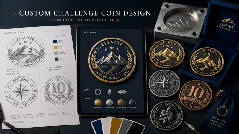
Step 6: Specify Color, Plating, and Surface Finish
Color should reinforce the identity of the organization. Use approved brand values rather than choosing shades by eye from a monitor.
For practical background on color handling across digital and printed workflows, review Adobe’s guidance on color for print.
Provide Pantone references when color accuracy matters, but remember that enamel, printed ink, polished metal, and antique plating reflect light differently. A digital mockup is a useful guide, not an exact representation of the finished object.
Common plating choices include gold, silver, copper, black nickel, and antique finishes. Polished plating creates a clean, reflective appearance, while antique plating increases contrast around recessed details. Selective polishing can make a central emblem stand out without adding more color.
Step 7: Design the Edge, Reverse, and Packaging
The edge is often overlooked, but it can add character through rope, diamond-cut, reeded, or engraved treatments. Edge text and serial numbering can also make the coin feel more personal or collectible.
Use the reverse side strategically. It may hold a mission statement, anniversary dates, award level, recipient name, or a second design that completes the story.
Packaging should match the purpose. A simple protective pouch may be enough for event distribution. A velvet box, acrylic capsule, display stand, or printed presentation card is more appropriate for formal recognition, retail, or executive gifting.
Step 8: Review the Digital Proof Carefully
The digital proof is the final opportunity to correct design problems before tooling begins. Check the exact dimensions, spelling, metal lines, enamel areas, plating, front and back orientation, edge treatment, and packaging notes.
Do not approve the proof only because it looks attractive. Confirm that each line represents the intended raised or recessed area and that every color is assigned correctly.
Ask someone who was not involved in the design to review the proof. A fresh reader is more likely to notice a missing date, incorrect title, or reversed symbol.
Step 9: Approve a Sample and Set Quality Standards
For an important project, a physical sample helps confirm weight, color, relief, edge quality, and overall presentation. Examine small lettering, enamel fill, plating consistency, and the alignment between the front and back.
The approved sample should become the reference for mass production. Quality checks should then compare production pieces against that standard rather than relying only on general descriptions such as “high quality.”
Before shipment, confirm the final quantity, packaging count, carton labels, and any variable information such as names or serial numbers.
Conclusion
A well-designed challenge coin begins with a clear purpose and ends with disciplined production control. The strongest results come from simplifying the message, designing for physical metal, choosing processes that suit the artwork, and reviewing every technical detail before mass production.
When meaning, design, and manufacturing are considered together, the finished coin becomes more than a promotional item. It becomes a durable symbol of recognition, identity, and shared experience.